PT
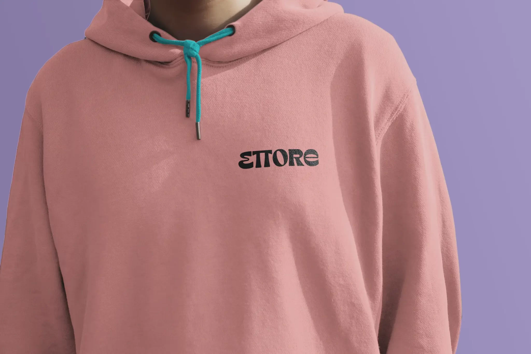
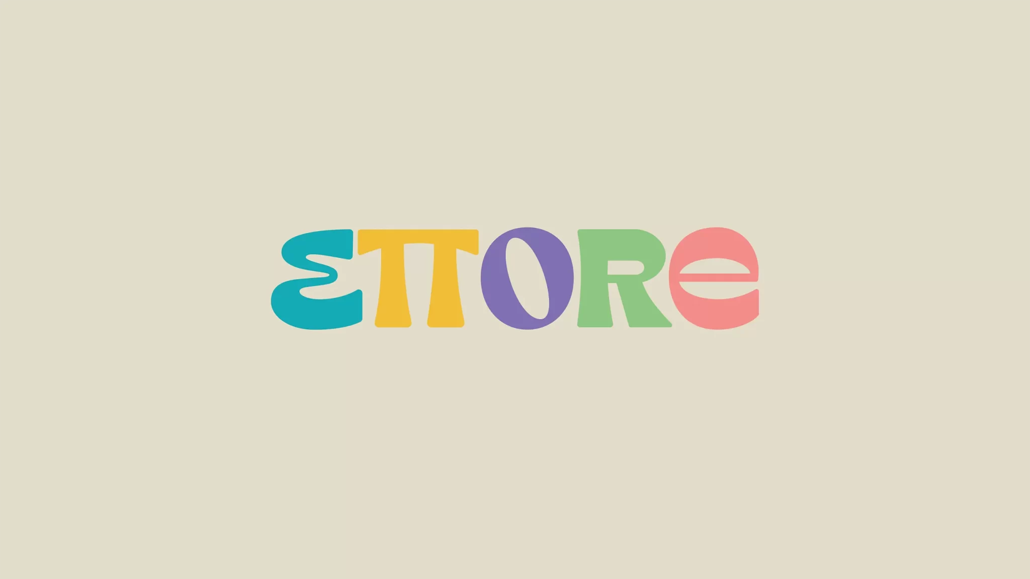
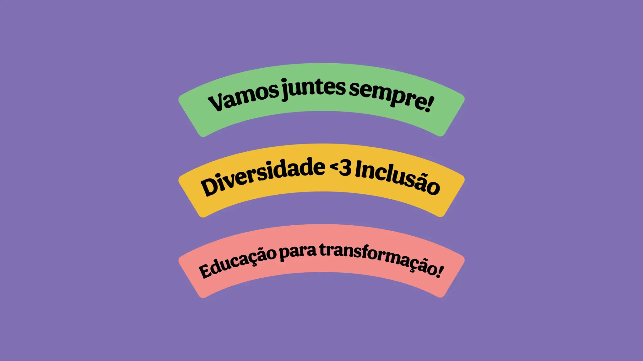
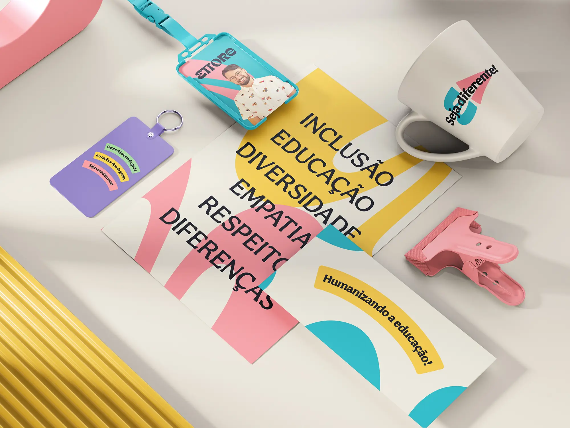
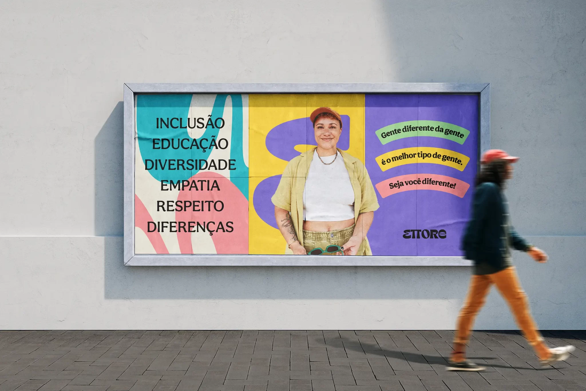
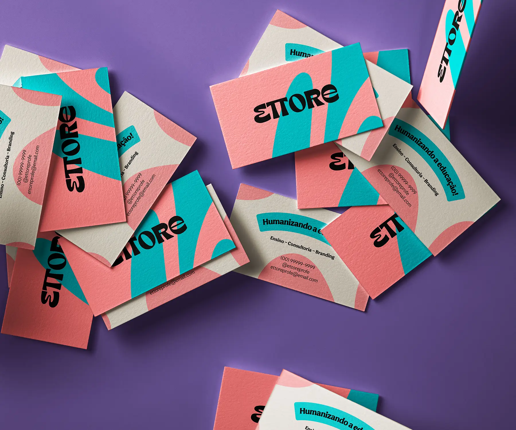
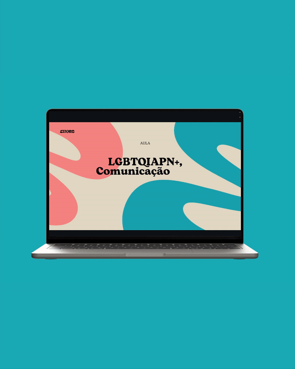
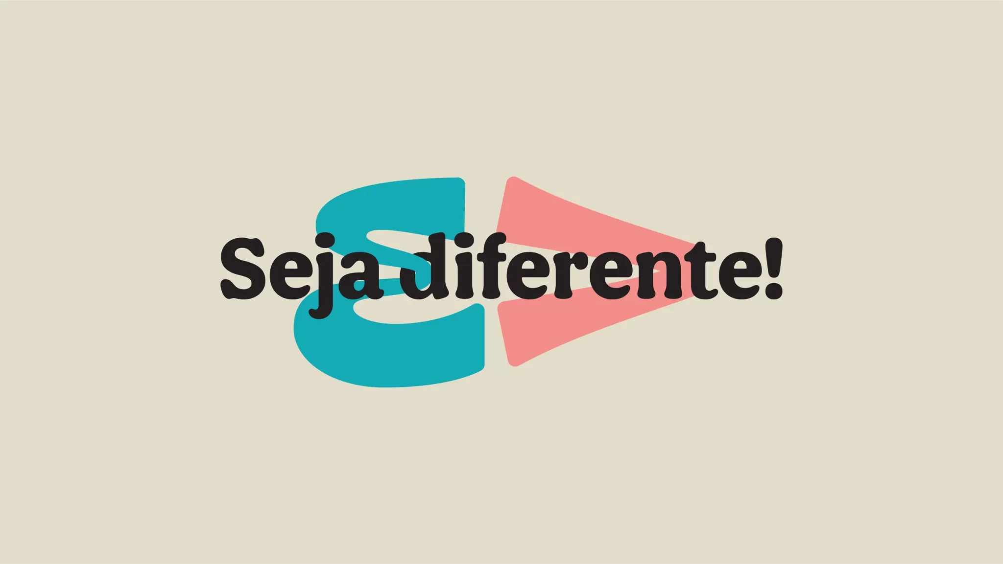
Para acompanhar a marca e garantir impacto, legibilidade e leiturabilidade, escolhemos duas tipografias distintas. Uma sem serifa e com bom conforto de leitura para ser utilizada em textos mais extensos e uma fonte com serifas arredondadas e características display para ser utilizadas em títulos e chamadas de destaque.
EN
To complement the brand and ensure impact, legibility, and readability, we chose two distinct typefaces. One sans-serif font with good reading comfort is selected for use in longer texts, while a typeface with rounded serifs and display characteristics is chosen for titles and prominent callouts.
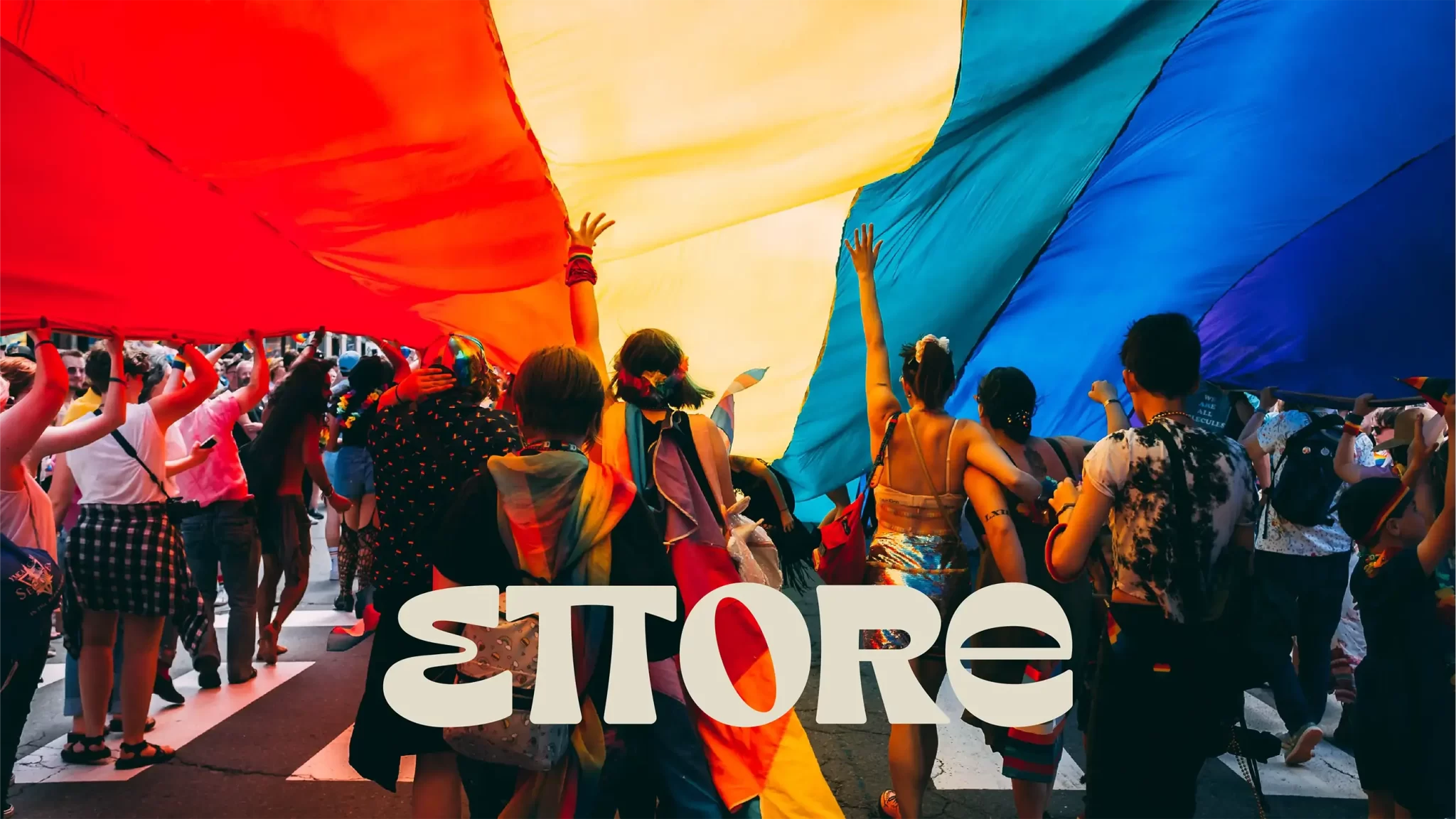
The goal is to facilitate the brand’s relationship and connection with a young, connected audience that is more open to behavioral changes.