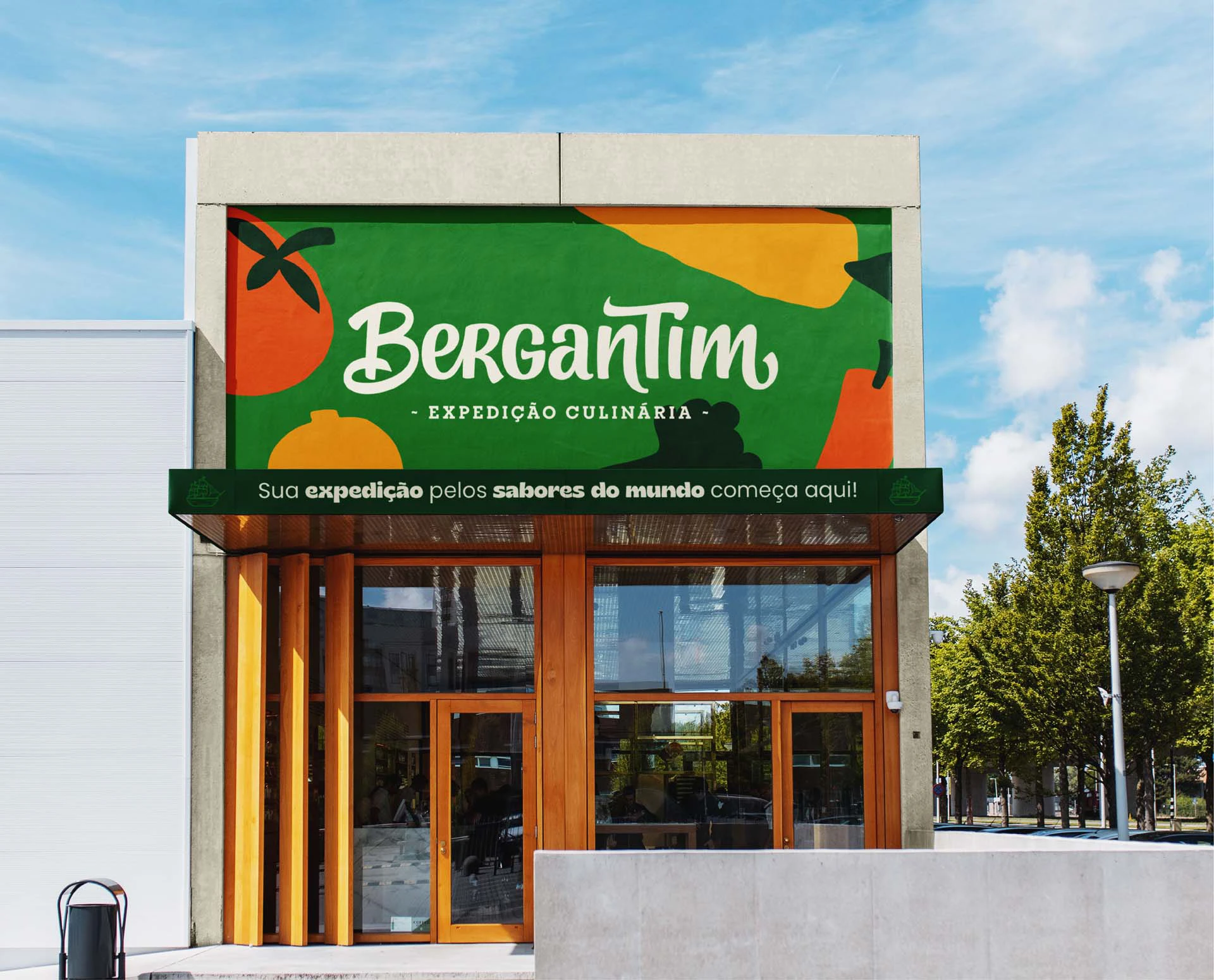
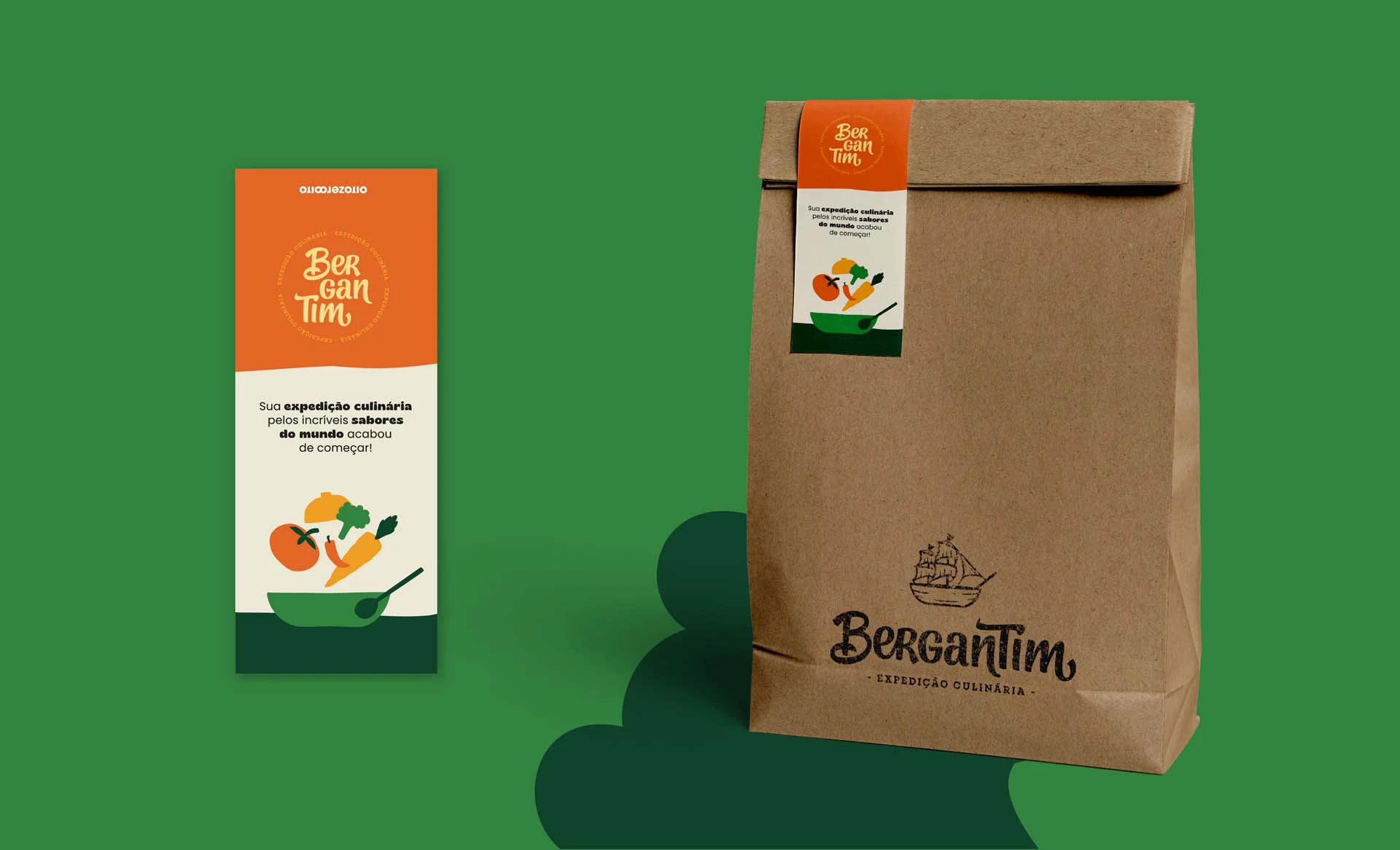
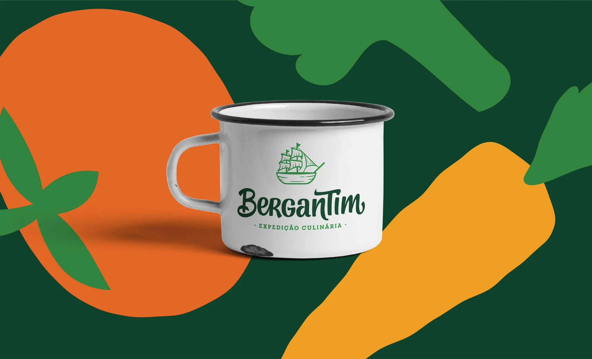
A empresa Bergantim Expedição Culinária está nascendo com o intuito de oferecer uma culinária simples, atrativa, gostosa e que possibilite que os clientes façam refeições ágeis, leves, e cheias de energia.
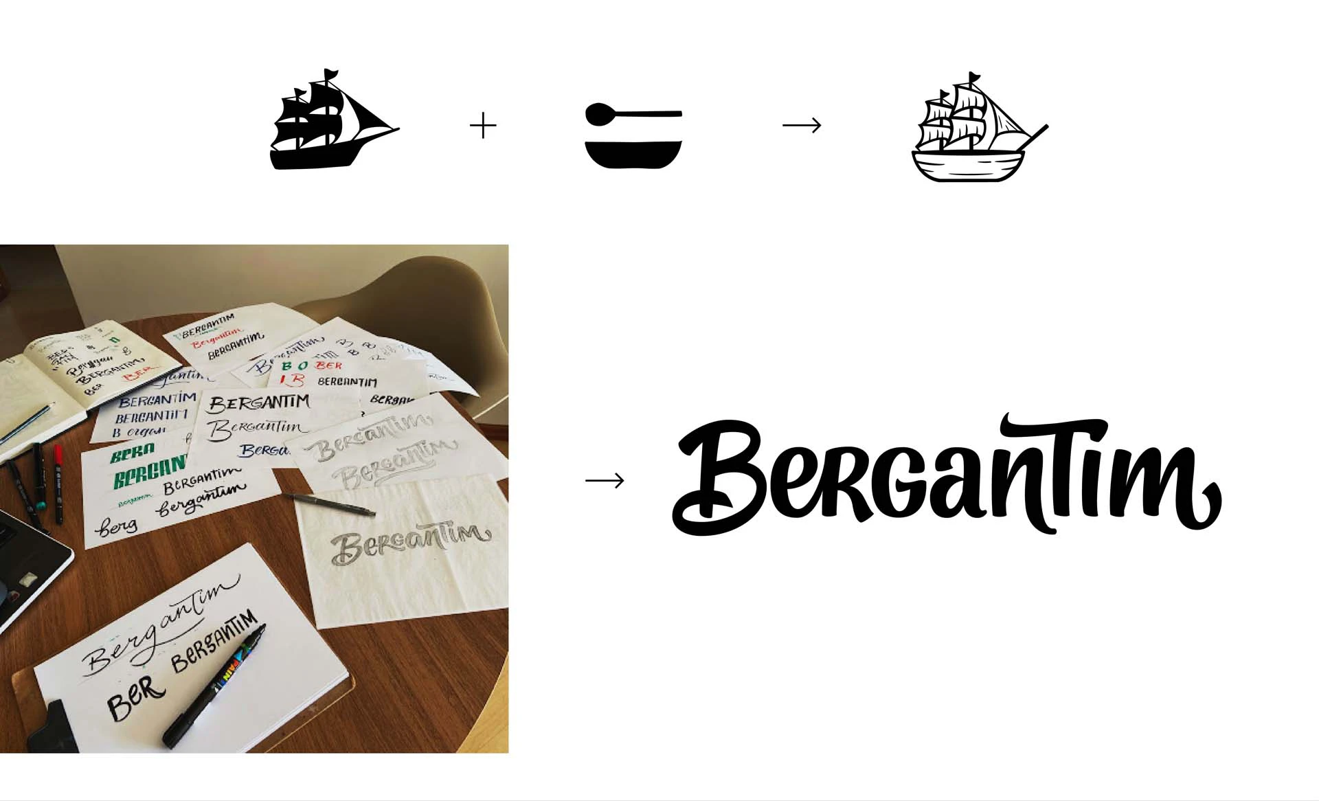
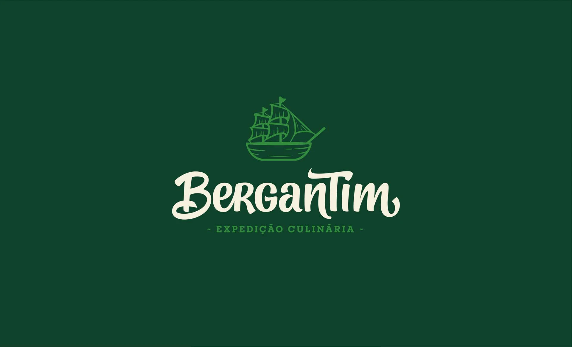
Na hora de criar a marca da Bergantim, foram levados em conta os conceitos: artesanal, enérgica, leve, humana, simpática e dinâmica. O logotipo foi feito a partir de um lettering para que trouxesse o lado humanizado e artesanal. As formas das letras sugerem simpatia e dinamismo, visto que, possuem curvas arredondadas e variam entre minúsculas e versaletes (maiúsculas pequenas). O símbolo é representado por uma ilustração inspirada na xilogravura, o que reforça o conceito artesanal da marca.